The Elements by Theodore Gray app good for
This is a beautiful example of presenting information in an informatve an esthetically pleasing way.
Stunningly beautiful eBook.
Warning: This app only supports landscape orientation on one side, which means its on the wrong side when youre using the iPad case in "bezel" mode.
UPDATED REVIEW for v1.0.1.3. The orientation problem is fixed. Now works in both landscape orientations.
Creative and classy - whether you are in school learning the periodic tables or are curious about the elements, this is the app for you! Hi res photos and even some 3D images that revolve, informative and entertaining, lists items that the element is used for ... facts abound.
This is one of the apps I most often show people when they want to see what an iPad is.
My complaint about the lack of cross-eye viewing has been fixed so this app is even better (though I gave it 5 stars before)
One other feature request is that it would be nice if you could pinch to zoom in some more when you are on the page with the enlarged view. Some of the object have fine detail that would be nice to inspect closer. For space reasons you might have to disable the rotation and only have zoom in on the "front" side.
Well worth the money.
(The large size is a necessity for all the photos included. But I made the mistake of clicking update on my iPad (thinking it would be a small patch not the whole multi-GB app). Luckily pausing the app download and syncing it from iTunes worked.)
I love this app, I couldnt find so much information on the elements in one place before.
Great writing and unique, engaging presentation ideal for the subject matter... and thats what matters.
Not quite perfect: the multimedia presentation is a bit gimmicky and limited, and 90% of the pictures I dont need to spin, let alone see in 3D. And the Wolfram Alpha data on each element is a bit of a shrug to me. But the writing is solid, and many of the pictures are beautiful and beautifully presented.
If the author and publisher had invested more in the content -- i.e. longer captions for the pictures, introductions to groups of elements -- I would have given it five stars.
Still, look at the non-existent competition. The Elements stands alone in the app store! I would buy something similar in a heartbeat ... but there is nothing else like it to buy. Quite a coup. I will always remember it as my first really satisfying ebook.
Sooooooo many metals ... :)
Some bad moments
An excellent and fun approach to elements, with cheeky writing and beautiful graphics. But the program crashes when the animated tabs are selected. Frustrating.
It wont load properly and keeps exiting the program. I have rebooted according to app support but did not work. Hopefully this can be resolved soon since I had to pay for this just to see how beautiful the promo said it would be.
Singularly unimpressed
Staggeringly large at 1.7 GB. Seems unnecessary even for fairly nice 3-D pics.
The navigation is awkward. There is no ability to swipe to move between elements. You have to press a small arrow at the bottom. The home button is way too small on every page. While the home page looks nice its tough to read the names and numbers of the elements.
Drop the price by 75%, drop the spinning photographs, drop the size by 80%, and then its worth four stars, maybe five. But only then.
Nice integration with WolframAlpha, but this only means that you have to be connected on WiFi or 3G to get that information. Ironic, given the size of this application.
All of the information is crammed on to less than one third of the screen so that there can be a spinning model of the element. Granted, the spinning models look nice, but that loses its shine when you struggle to get the more detailed information.
Hugely disappointed. This was one of the first apps I wanted to get for the iPad.
If I could, I would return this app and then repurchase it when it improves, which I suspect it will.
OVERVIEW:
On the main Home page, and on the "home" page of each element, there is a lot of animation, which as far as I can tell, cannot be disabled. I find this extremely distracting and irritating. Caveat: I have not read this complaint in any other review, so it makes me wonder if it is just me - perhaps my age (Im in my 50s)? If my suggested enhancement (below) is implemented, I will improve my rating.
ENHANCEMENT REQUEST:
Nevertheless, I beg the author to do something about this issue. As a first pass, you could provide a switch (a setting option) which allows the user to disable all auto-animation. This would make the main Home page, and each elements home page, completely static (as well as any auto-animation that may occur in other contexts). A second pass would allow the user to disable all auto-animation, but then selectively re-enable it (such as being able to turn, spin, or immobilize an elements home page image).
DETAILS:
Home page (forced animation - bad):
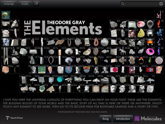
The Home page for this app is the periodic table. For each element, there is an image which either continuously rotates, or continuously scales up and down (zooms in and out). There is little benefit to this presentation, other than a gimmick factor. On the downside, however: 1) it is irritating and distracting. I have trouble focusing on one element, with all the other ones being in continuous motion. 2) the element symbols (H, He, Li, etc) arent even nicely presented - they are in a dull grey fuzzy font which does not stand out.
Of course I want to see beautiful images, animation, 3D, etc, in other parts of this app, but for the Home page, I would take almost any periodic table from a google image search over this one.
Element home pages (forced animation - bad):
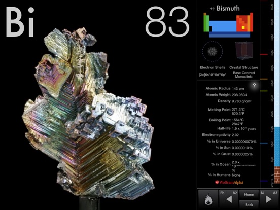
On the homepage of each element, the left two thirds of the screen is taken up by an image, which is continuously animated. The right third (or less) of the screen contains information about the element. I have a lot of trouble reading the element info when most of the screen is taken up by a giant rotating gold nugget, or even worse, a big photo of Albert Einstein that continuously grows and shrinks and moves around. And even in the info portion of the screen, there are a number of smaller, yet still distracting, continous animations (such as crystal structure), together with the static info that I am trying to focus on.
Element second pages (optional animation - good):
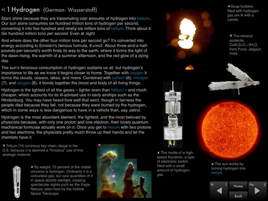
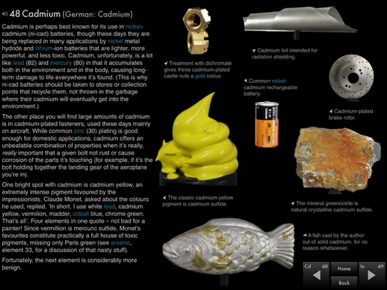
From an elements home page, you can go to a second page for the element. The second page contains a (text) article about the element, and a number of images (mostly photographs). By default, everything is static. However, each image can be rotated, spun, or immobilized by the user. Double-clicking on an image brings up a 3D version of it (a double image which can be merged using 3D glasses or perhaps by crossing your eyes). This *optional* animation is great - if only the whole app were like this.
Its a well made app, albeit on the huge side in terms of size, and its served me well during the academic year. It gives useful data about all the elements, as well as an anecdote or two, which far deepened my interest in chemistry.
Heres the problem: it was all good until iOS 4.2 came out, but Touch Press or Theo Gray didnt release a compatibility upgrade. Now, the app is the same size, with an unconventional button-based UI, munches memory thanks to multitasking but isnt multitask-compatible itself. Another problem, which has appeared on my friends iPads is in iOS 4.3, especially with multitasking gestures enabled. Switching from another app to The Elements will make almost the entire, or sometimes the whole black background transparent, with an animated periodic table hovering over your home screen (or whichever switchboard you mightve been on before you started the app).
When I bought it, in September, it was entirely worth the 14$. Now, unless an update comes out, Im leaving it at 3 stars and the following comment: unless youre truly desperate (or running iOS 3.2), dont waste your money.
An interesting survey of the elements.
However, the " reasonable but high quality" 3d glasses are a small cardboard box with two pieces of prismatic film covering holes punched in the side. It does have 2 quality elastic bands for your ears! Cost me $10 in Canada, worth maybe 50 cents.


